Brief
Honeywell Fire Alarm Panel
Design a next-generation fire alarm control panel with a fresh design language that aligns with Honeywell's product principles. The goal was quick, legible concept visualisation — original design thinking, bold exploration, and a clear creative point of view, rather than a production-ready solution.
Fire panels sit in an unusual design category: they're safety-critical, code-regulated, touched by several very different kinds of people, and almost always styled like the enclosure was an afterthought. That gap — between how much the object matters and how little care usually goes into it — was the starting point.
01 — Understanding: four people, one panel
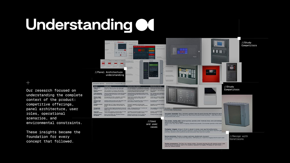
Before any form work, the team mapped the complete context: what fire panels already exist and how they're built, how the internal electronics constrain the enclosure, who actually operates one, and what has to happen in the seconds after an alarm trips.
That research settled into one governing problem: a single panel face has to serve four completely different mental models, and it can never be allowed to confuse them.
Operating personas
Occupant/bystander — rare contact, high panic
Untrained, sees the panel seconds after hearing the alarm. Needs to know where the fire is and which way is out — and must never be able to break anything or trigger the guarded evacuation action.
Fire warden / facility staff — quarterly training, moderate stress
Operates under time pressure while holding a radio. Needs the zone map, device detail, PA paging, and phased-evacuation presets — often one-handed.
Firefighter / brigade — first response, zero familiarity
Arrives 4–10 minutes in, in smoke, having never seen this building before. Needs an instant floor map, smoke-control and lift-recall status, and keyswitch-gated overrides in the same place every time.
Service technician — routine, no stress
Runs walk tests, disablements, and log exports. Needs device-level diagnostics, a USB/laptop port, and the ability to tag an impairment without the alarm state overriding them.
Scenario-first, not screen-first
Rather than designing the interface first and hoping it held up, the team built a scenario matrix — working backward from real events to what the front panel has to make possible, and what that costs to manufacture.
Design consequence: one face, four mental models. The eventual concepts resolve this with layered access — a read-only surface for occupants, a touch UI for wardens, keyswitch-gated overrides for brigade, and a PIN or laptop port for technicians — rather than four different panels.
02 — Form exploration
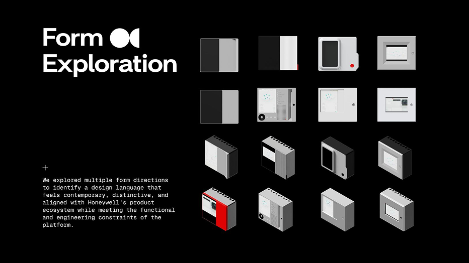
With the functional constraints set, the team explored multiple form directions in parallel — looking for a language that reads as contemporary and distinctive without abandoning the engineering reality of the platform: fixed screen sizes, keyed access, wall-mount depth, and serviceable internals.
The explorations ranged from flat, wall-plate-like volumes to deeper, more architectural enclosures with visible material breaks — testing how much of the panel's presence could come from proportion and detailing alone, before color or screen content entered the picture.
03 — Material reference
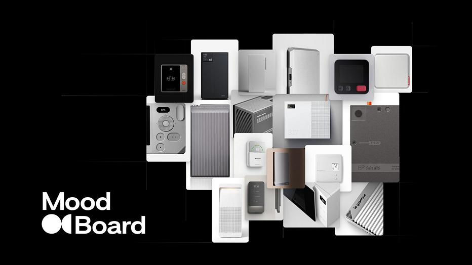
The moodboard deliberately looked outside the fire-safety category — toward thermostats, access controllers, home audio, and switch hardware that have already earned a more considered material language than the beige injection-molded boxes most panels ship in today.
Perforated speaker grilles, milled aluminum edges, matte ceramics, and soft-touch switch plates all fed into the CMF direction that followed — proof that a life-safety object can look considered without looking decorative.
Direction One — The robust form
Robust form · Failsafe interaction · Purposeful simplicity
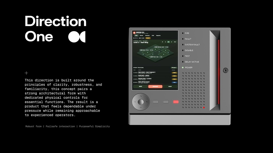
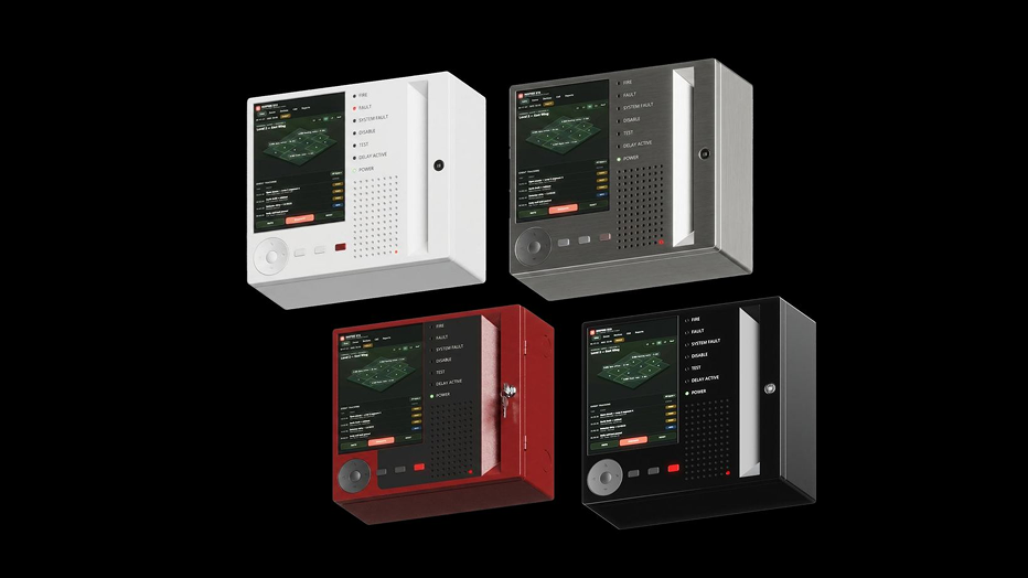
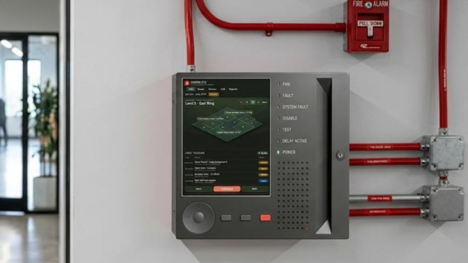
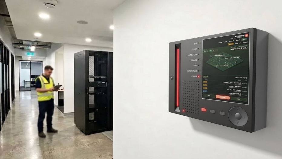
Built around clarity, robustness, and familiarity. A strong architectural enclosure pairs a landscape touchscreen with dedicated physical controls for the functions that can never depend on a UI rendering correctly. The result is meant to feel dependable under pressure, while staying approachable to an operator who already knows how fire panels work.
Screen: Zone map, live event tracking log with fault/status tags, and persistent Mute / Evacuate / Reset controls along the bottom edge.
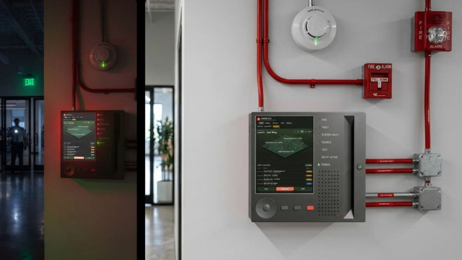
Physical interaction: A large jog dial for navigation, three hard buttons for the highest-frequency actions, and a keyed lock — so critical functions survive a frozen or unreadable screen. A status LED column (Fire, Fault, System Fault, Disable, Test, Delay Active, Power) sits beside the screen, always visible regardless of what's on it.
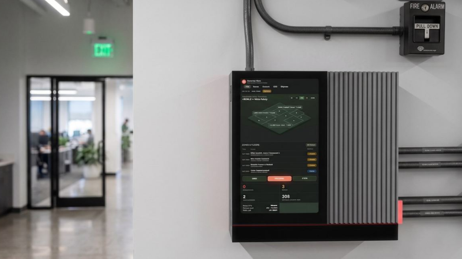
Direction Two — The monolith
Monolith form · Digital first · Purposeful minimalism
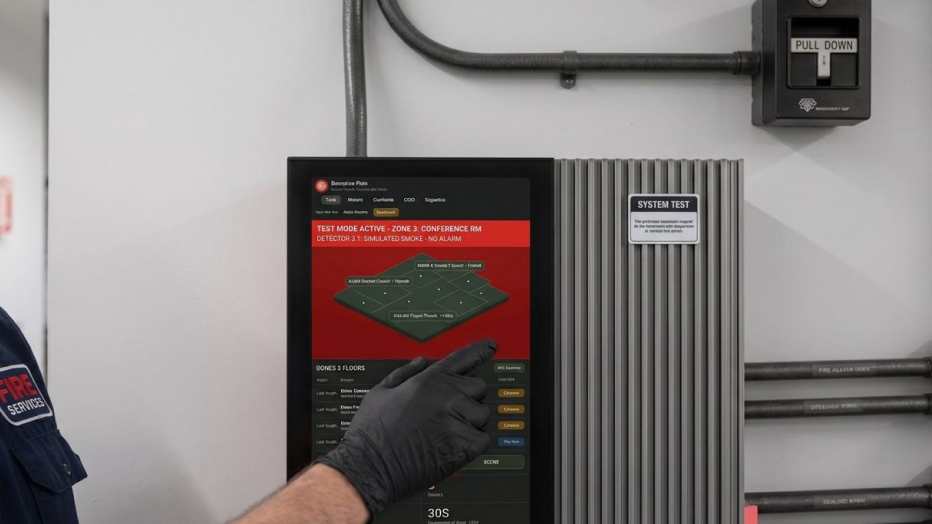
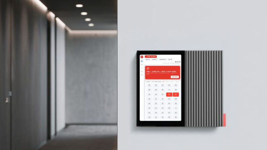
A quieter, more refined industrial expression. A single monolithic volume reduces visual noise so the interface itself becomes the focal point — the screen runs nearly the full height of the face, with a finned heat-sink-like rib section and a slim red accent seam standing in for the physical controls of Direction One. Architectural detailing and a restrained accent color aim for a premium, contemporary read while still carrying the presence expected of life-safety equipment.
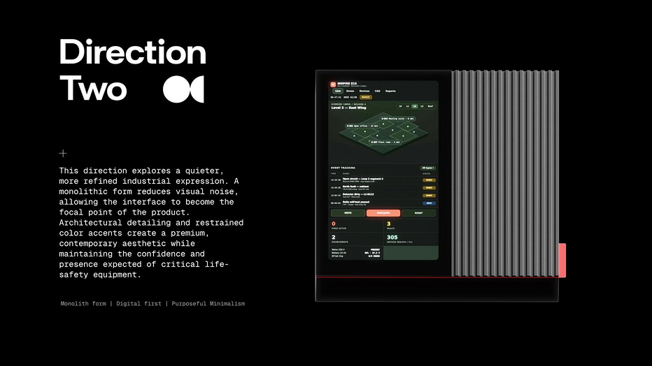
Screen: Full-height touch surface with a persistent status dashboard above the zone map — fires active, faults, disablements, and devices healthy, shown as numbers, not just icons, plus mains/battery status.
Physical form: The ribbed side panel and red seam replace hard buttons as the panel's tactile signature — a heat-sink language borrowed from the CMF references rather than a legacy control layout.
Two bets, deliberately left open
Direction One and Direction Two aren't a shortlist of one winner and one runner-up — they're two different answers to the same question: how much of a life-safety interaction should live in hardware you can feel in the dark, versus a screen you can trust to always be readable?
Direction One keeps failsafe actions physical and puts a status column outside the screen's control entirely. Direction Two bets that a well-designed, high-contrast dashboard screen can carry more of that weight than fire panels currently give it credit for — while still keeping a hard accent line as a non-digital fallback cue.
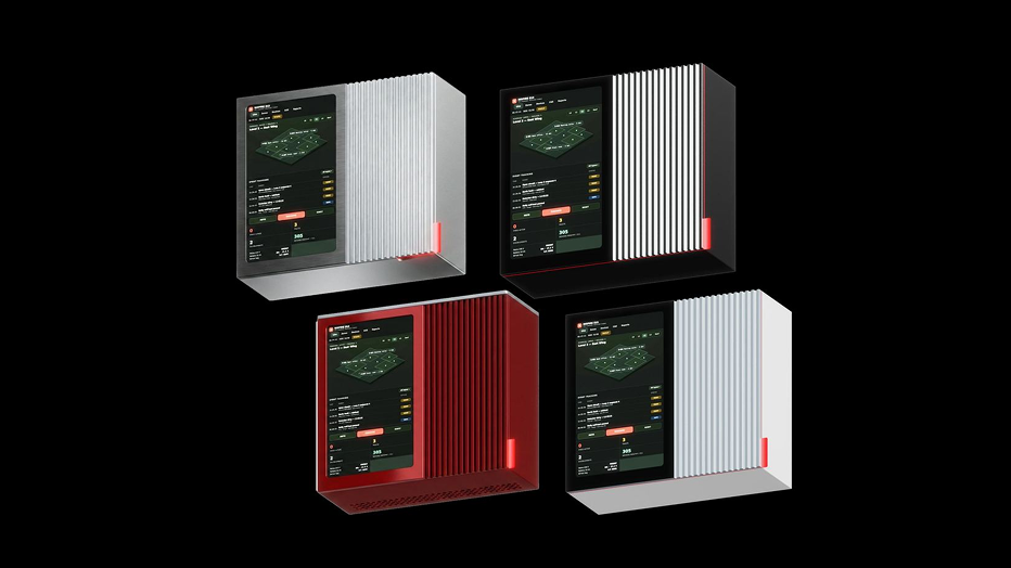
Both directions were developed to the same depth: research-grounded personas and scenarios, a shared form-exploration pass, full CMF variant sets, and rendered in-context on a wall, next to the pull stations and smoke detectors they'd actually share a corridor with.
As concept work, neither is a finished spec — the point was to hand Honeywell two credible, fully-reasoned directions and a clear point of view on each, and let the next stage decide what gets built.